01
Project Introduction
Duwo was our premiere project. The goal was to develop a custom futuristic looking typeface and solid branding for the client.
We’ve accomplished this by combining a foundation of thorough research with some creative experimentation.

02
Brand Logo
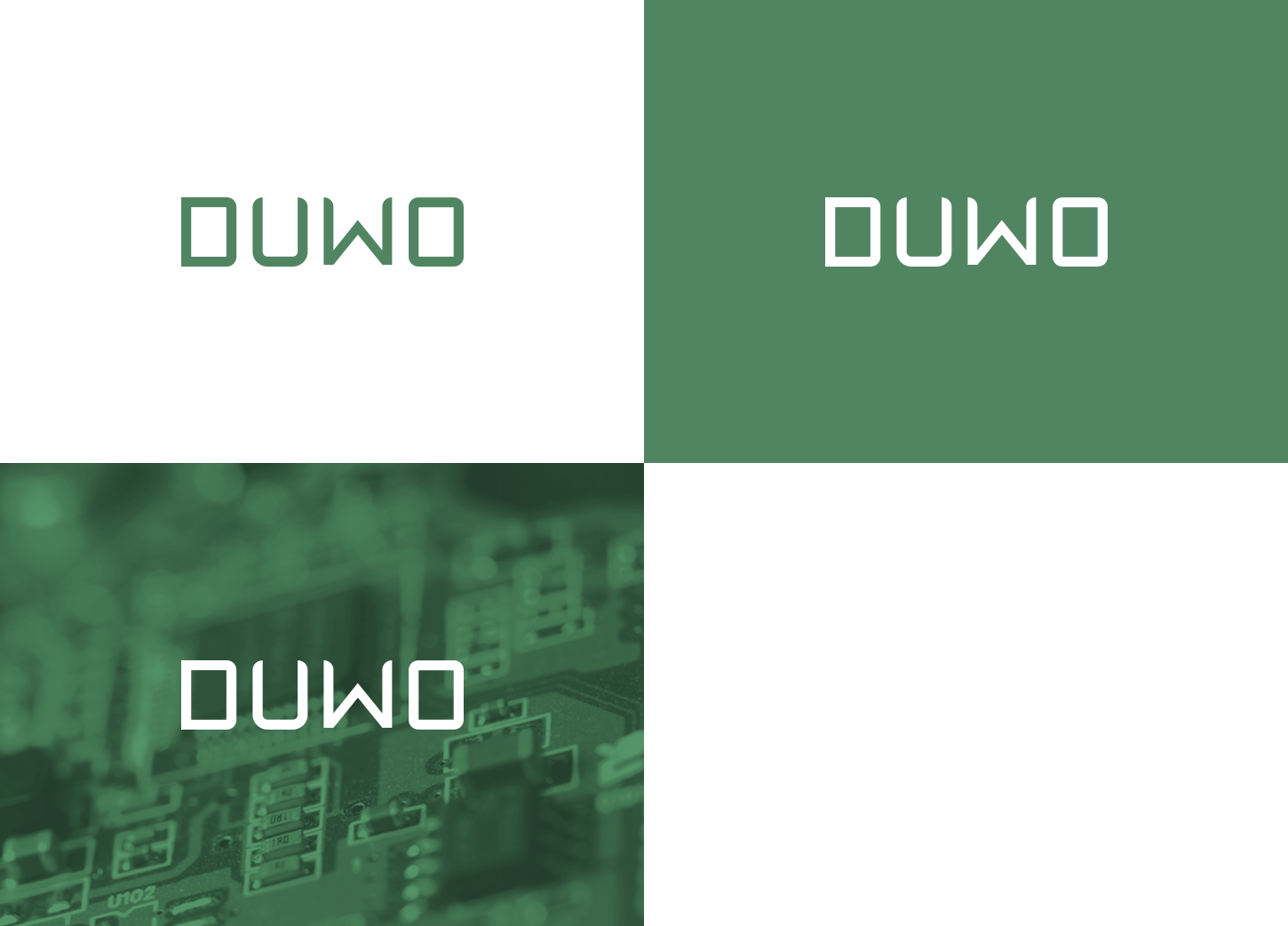
The client requested a simple and intuitive logo to represent the engineering roots of the company.

03
Brand Pattern
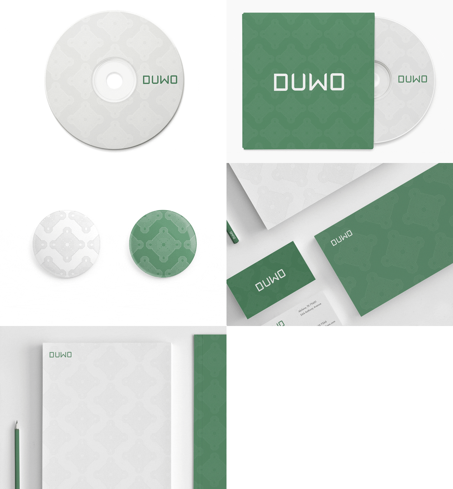
The pattern is reminiscent of the copper tracks found on printed circuit boards (PCBs), something that synergises well with the company’s core business.

04
Color Pallete
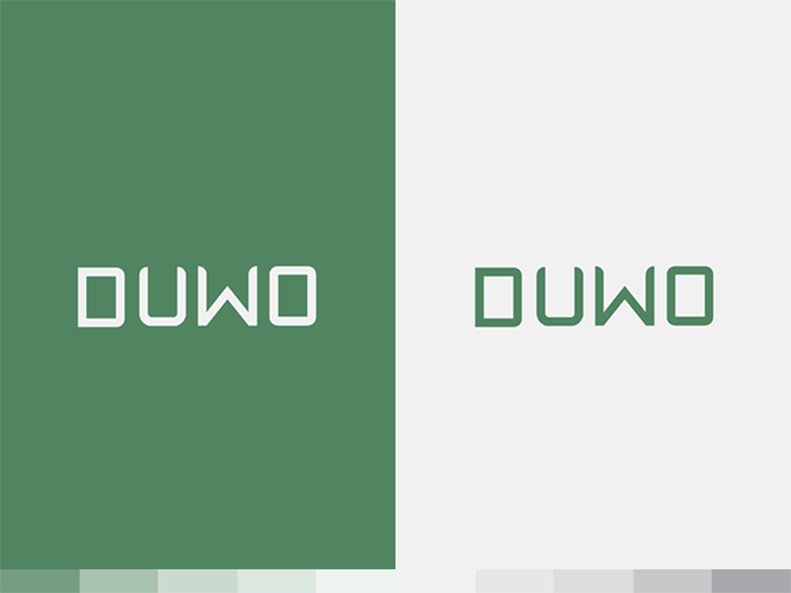
The color palette was picked with aid of a mood board which lead to the below result, further strengthening the PCB themed brand pattern.

05
Typography
Our bespoke typeface conveys a futuristic and minimalistic feeling, while hinting at a sense of efficiency which further strengthens the representation of the company’s core values.
The typeface is now used in all of the company’s communications, including their logo.

06
Branding
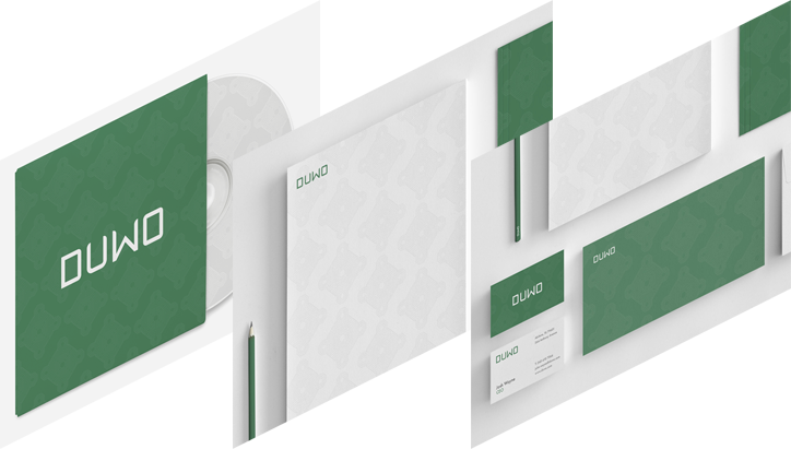
As can be seen below, the branding beautifully combines the custom pattern, color palette and typeface together. It uniquely showcases how each element interacts with and enhances the others.

More selected projects
