01
Project Introduction
Hydra is Software Company, Nestled in the Portugal which works with various companies and little clients from the USA to Europe.
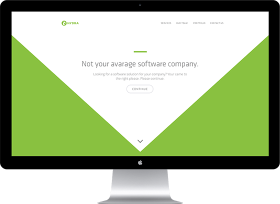
The client wanted a simple yet intuitive one-page responsive website and branding for their company.
02
Landing Page
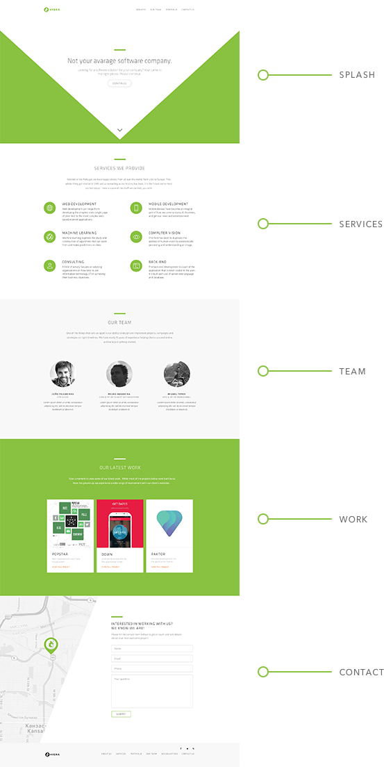
The landing page was engineered in a segmented fashion and focuses on communicating and exposing those messages and functions that are crucial to its visitors. We then combined that with a beautiful design.
03
Responsive Layout
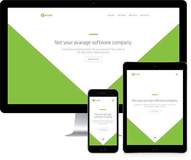
The site’s layout was engineered from the ground up to perform optimally across all devices.
Our strict testing and quality assurance protocols guarantee that the site performs smoothly across all browsers and devices.
04
Color Pallete
The client expressed the desire for a vibrant, yet classical color scheme. This are the colours used in their branding.

05
Iconography
We created a custom set of minimalistic icons that clearly represent each of the software proficiencies that Hydra caters to.
06
Typography
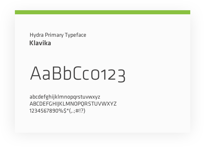
We settled on the Klavika typeface, which synergises well with the type of industry the client is operational in. It has an air of professionalism through its simplicity and fully fits with the logotype.
07
Branding
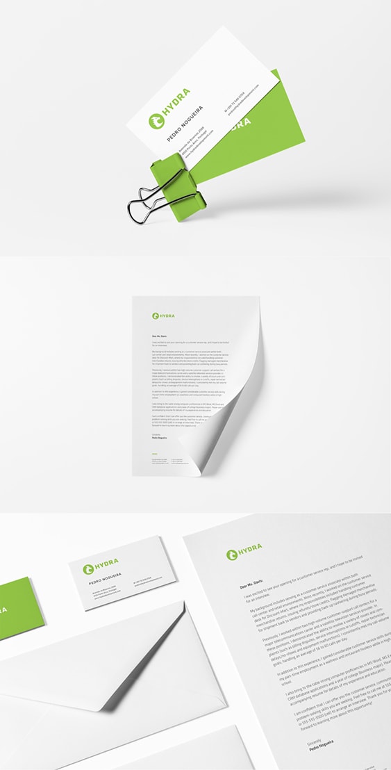
As can be seen below, the branding beautifully combines the logo, color palette and typeface together.
It uniquely showcases how each element interacts with and enhances the others.
08
Favicon
We created a matching favicon that works great on both PC and Mac, as well as iPhone, iPad, Android phones and tablets, Windows 8 tablets and other mobile phones.
09
Performance
We managed to get the full website to weight a whooping 340kb which is really great considering all the big images we have on the landing page.
The website loading varies from a 800ms to 1500ms depending on the device and internet connection.

More selected projects
