01
Project Introduction
Moco is an electrical engineering company located in Skopje that provides a variety of services.
We were tasked with creating a new visual identity that represent the key values of the Moco Electronics brand.

02
Brand Logo
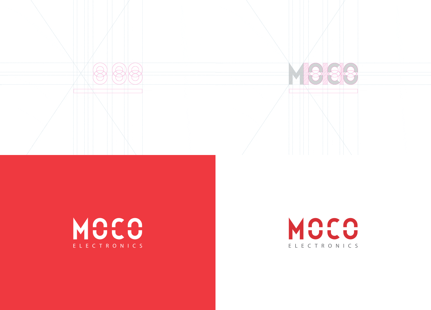
The client requested a simple and intuitive logo, which represents the electricity and engineering nature of the company.

03
Brand Pattern
Moco’s brand pattern elegantly represents both its connectedness to its clients as well as its electrical engineering background.

04
Color Pallete
We’ve reused the clients existing color palette to preserve brand identity toward its customers.

05
Typography
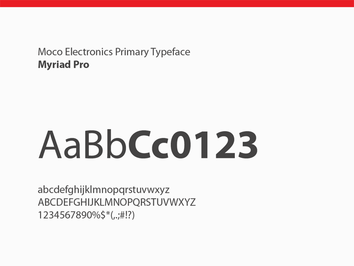
The client wanted a simple and modern typeface to match the company’s identity. We settled on the Myriad Pro typeface, which also synergises well with the type of industry the client is operational in.
Myriad’s clean, open shapes, precise letter fit, and extensive kerning pairs make it perfect for our use case.

06
Branding
As part of the offline marketing we designed a broad range of creatives, ranging from CD’s and badges to vehicle branding and wall decals.
Here is a short example of the branding material that was delivered to the customer.

More selected projects
